 NEWS
NEWSThe Gap Logo Debate — Does the Icon Matter to You?

Oct. 8 2010, Published 5:53 a.m. ET
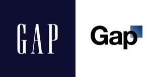
There seems to be quite a controversy over the new Gap logo released this week by the iconic brand. A definite contrast from the original logo (dating back to the clothing line's foundation in 1969) the new basic logo features large black text with a little blue box in the right hand corner.
The institution that is The Gap has received a huge backlash since the introduction of this new logo.
Ad Age summed up one major critique, citing: "Across the internet detractors have been picking apart the new look, with the most common sentiment being that it looks like something a child created using a clip-art gallery."
Gap's marketing team reacted quickly to the buzz, turning the the negativity surrounding the new logo into a contest on their Facebook page!
Gap president Marka Hansen took some time to respond to weary Gap fans, via Huffington Post:
The natural step for us on this journey is to see how our logo - one that we've had for more than 20 years - should evolve. Our brand and our clothes are changing and rethinking our logo is part of aligning with that.
Want OK! each day? Sign up here!
We want our customers to take notice of Gap and see what it stands for today.
We chose this design as it's more contemporary and current. It honors our heritage through the blue box while still taking it forward.
And, just to namedrop a few of the celebs who have worked on Gap campaigns ... Zoe Saldana, Will Arnett, Amy Poehler, Amy Adams, James Marsden, John Mayer, Anne Hathaway and Liv Tyler. (Also recall the brand's famous RED campaign featuring a plethora of A-listers)
In honor of the old Gap logo, catch the classic ad below featuring Madonna and Missy Elliot.
How does the change of logo make you feel? Do you want to fall in or out of the Gap?


