 NEWS
NEWSNew Wordless Starbucks Logo — Are You Steamed Up?

Jan. 5 2011, Published 10:00 a.m. ET
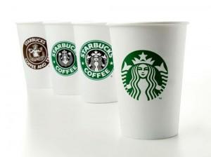
First the Gap caused a quake trying (and failing) to introduce a new logo, and now Starbucks? The Seattle-based coffee corporation has modified its siren-centered logo, leaving the iconic sea creature to do all the talking!
That's right — your coffee cups and coffee collars from the world's largest coffee company will be wordless.
Starbucks unveiled a new logo today at its Seattle headquarters, dropping the text and focusing on the (now green) siren, the Associated Press reports.
"What is really important here is an evolutionary refinement of the logo, which is a mirror image of the strategy," Howard Schultz, CEO of Starbucks, said at the unveiling. "This is not just, let's wake up one day and change our logo."
OK! NEWS: THE GAP LOGO DEBATE — DOES THE ICON MATTER TO YOU?
The facelift marks a new direction for the company, as it rebounds from a tough economic period.
The current revamp is the fourth version of the Starbucks logo since the company was founded in Seattle in 1971. The first modification was in 1987, changing the original brown logo to a green-and-black color palette.
Want OK! each day? Sign up here!
So when will the logo change be implemented? In March, in celebration of the company's 40th anniversary!
OK! NEWS: COFFEE OR COCKTAIL? STARBUCKS TO SERVE BEER & WINE

